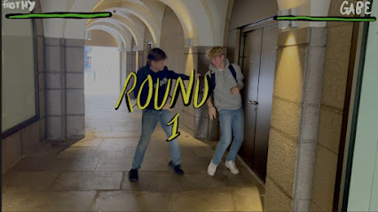
My video contains lots of stop motion animation, and I’ve done this using Procreate which i have to animate frame by frame, this is time consuming but it does give the feel of it being hand drawn which is the look I was going for. To fit in with the theme of it being a celebration of childhood, I wanted to animation to look as though they could’ve been drawn by a child with a crayon because of the bright colours and the objects depicted are that of which you could expect to see in a child’s doodles.
Thursday, November 24, 2022
Animation
Logo Design
This is the logo I have designed for my artists, I think the colours combined with font give off the same aesthetic as the rest of the video and website. I also used images that feature in the video to achieve more cross media convergence.
Intertextual references
I wanted to rely on quite a lot of intertextual references, as my video is about the idea of being a child and to value childhood experiences so I wanted to use nostalgia to recognise the audience’s shared experiences of their own childhoods.
Shop products
This is the development of the artist’s merchandise, the products are all hand designed and i used the same background as the album cover to increase the brand identity and cross media convergence. The inclusion of the glasses from the video, is a gift to the real fans and gives them the opportunity to own the authentic product from the video, I thought that this would appeal to the aspirational audience.
Subscribe to:
Posts (Atom)
-
https://youtu.be/JYCgiW1lOgU


